
Creating an impactful digital experience begins with a deep dive into user behavior and accessibility requirements. For our web platform, the initial phase of the UI/UX workflow focused on understanding the specific digital literacy levels and physical device constraints of our target users. By identifying these user personas early on, we established design principles aimed at reducing interface clutter, maximizing text legibility, and ensuring that the platform’s layout remains intuitive enough for users of all technical backgrounds to navigate seamlessly.


Before touching any design software, the ideation process kicked off with rapid low-fidelity paper sketching to explore structural layouts and navigation flows. This hands-on phase allowed for quick experimentation with element placement, such as positioning primary assessment buttons, user navigation bars, and data display areas. Mapping out the interface on paper served as a crucial blueprint, ensuring that the core system functionality and user journeys were logically structured before dedicating time to digital production.
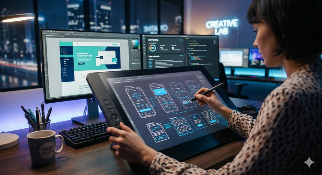
Once the conceptual layout was locked in, the project transitioned into digital wireframing and high-fidelity prototyping using modern UI/UX design tools. In this stage, abstract sketches were transformed into precise, clean digital components, establishing a cohesive visual identity with balanced typography, consistent spacing, and an intentional color palette. Developing these detailed digital mockups allowed us to simulate interactive user flows, refining how menus expand, how forms submit, and how data elements transition across screens.
The final phase of the prototyping lifecycle focused heavily on cross-device responsiveness and optimizing layouts for seamless implementation. Given that users access web platforms across a wide variety of hardware—ranging from desktop computers to mobile screens—every interface component was rigorously tested for fluid scaling and adaptation. This meticulous attention to responsive design principles ensured an identical, uncompromised user experience on any device, providing a flawless structural guide ready for direct frontend development and layout deployment.